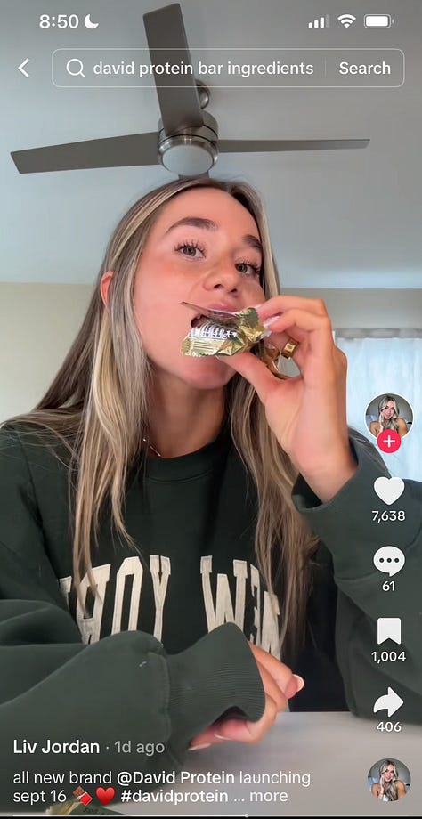
If you’ve been paying attention to fitness, wellness, or even startup circles on X, you’ve probably seen all the fuss about David, the new protein bar making a big splash before it’s even hit the shelves.
David is the brainchild of Peter Rahal, the exited founder and former CEO of RxBar, which was acquired by Kellogg in 2017. Rahal had kept a pretty low profile on social media until one unassuming day in March when he tweeted about his next venture:
Now, with a bold approach to branding, game-changing macros, and a clever strategy to get influencers talking, David is positioning itself as more than just another protein bar. Here’s how they’re doing it:
Show, Don’t Tell: How David aced positioning
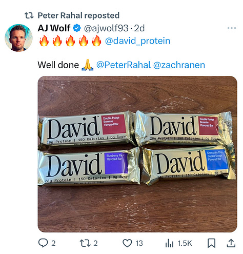
David knows its audience inside and out: fitness enthusiasts, gym-goers, and health-conscious consumers. What do they care about most when picking up a new protein bar? The macros. And David’s are unbeatable: 28g protein, 150 calories, 0g sugar. The nutritional profile is impressive for a protein bar, and David isn’t afraid to show it.
The macros are front and center in all of David’s marketing materials, because that’s the key selling point.
I often see companies of all sizes struggle to communicate the value of their product, writing excessive copy to explain why they’re better than their competitors. David lets the product speak for itself—clear, simple, and straight to the point.
It’s not just about great nutrition, though. David solves a real need for people trying to bulk up, stay fit, or live healthier. Their clear, no-nonsense messaging sticks in the minds of consumers and gets people talking.
A symbol of strength: David’s branding and identity
And then there’s the story of David, which is the bow tied around this gorgeous, glimmering gold bar of protein mush.
David’s brand identity was created by the brilliant people at DayJob, and speaks directly to its target consumers—people who are focused on health, fitness, and obsessed with achieving their “best self”. It’s inspired by Michelangelo’s sculpture of David, representing strength, precision, and perfection.
Just as the statue was carefully chiseled into its final form, David (the protein bar) reflects that same craftsmanship, captured perfectly in their tagline: “Rigorously Perfect Protein.”
The David statue imagery plastered all over their website and socials speaks for itself: eat this, and you can be chiseled, too.
The logo—a chisel—reinforces this idea of artistry, perfection, and hard work.
The bar’s regal gold packaging adds a feeling of excellence and achievement. It’s not just eye-catching—it’s quite literally a gold bar, communicating the product’s premium quality. This product packaging will undoubtedly stand out on grocery store shelves.
Turning influencers into early advocates
When David launched in March, it quickly caught the attention of fitness and wellness influencers, all eager to try the protein bar with unbeatable macros. David took note.
Last week, the company started sending out their gold bars to influencers who’ve shown interest in the brand (a follow here, a tweet reply there) and ran a giveaway on X for early adopters to get their hands on the product before anyone else.


Without paying for traditional influencer marketing, they’ve seen organic posts roll in from excited influencers and early adopters who are thrilled to be first in line.
What’s next for David
With $10M in seed funding from influential backers like Peter Attia and Andrew Huberman, the brand seems to be set up for success. They have a clear approach to branding and marketing, influencer-investors who will advocate for the brand, and macros that your local gym bro simply cannot resist.
David will officially launch on September 16th, and their trajectory so far has been fascinating. The brand is building what feels like a “cult following” before having even launched a product! But will David have mass-market appeal once it hits the shelves? We’ll just have to wait and see.
Anita is a NYC-based product marketer with a focus on brand building, content strategy, and growth hacking.
Get in touch: itsneetie@gmail.com.


I was just looking at this yesterday! They have definitely nailed their positioning. The ad seems to be inspired by older apple ads (mimicking the font, style, etc).
Not gonna lie I’m very curious to see how they perform when they’re out! The amount of protein is astronomical for a bar and I see how it can have lots of success with a specific group of people who actually count their macros. I’m just not too sure the visual excites me - I know it’s gold but it feels like it’s lacking something, I just can’t pinpoint what it is!!!